Wattpad Creator Sonia (@SoniaJohn) has been writing on Wattpad since 2015. One of her most popular stories on the platform is Plutonian. The views and opinions expressed in this article are those of the author and do not necessarily reflect the views and opinions of Wattpad corp. or affiliated companies.
Have you written a story but find yourself procrastinating when it comes to making the cover? Are covers really that important? Here’s why your cover can make or break your story, plus some simple tips for designing a cover that looks great and accurately represents your story, genre, and themes.
As an avid reader and writer on Wattpad since 2015, I can tell you that I have chosen stories to read based on how attractive their covers were to me. Let's face it, there are hundreds of stories curated on the Wattpad home feed, but you don’t see their blurbs or first chapters. The first thing you see are their covers. As a writer or aspiring writer on Wattpad, it’s important to know how integral it is to catch someone’s attention with your cover because that is what will earn you that first click. I have personally experienced a growth in readers when I put more effort into my story covers. Granted the story itself is what you need to attract more engaged readers, but none of that will happen if readers aren’t enticed to click on the story to begin with.
My journey with story covers was a pretty slow and gradual one.
When I wrote my first story on Wattpad, I made the mistake of not paying much attention to my story cover. The story title was The Perfect Date and it was a horror story about a girl who had been kidnapped and was forced to date the antagonist.At the time, I paid too much attention to perfecting the first chapter and rushed through the blurb and story cover. I simply googled a picture of a kidnapped girl and pasted on my name and the story title using Photobucket, not giving much thought to whether it would attract readers (or even if I was following copyright rules. Yikes, I know. I was living dangerously then.)
There were a few reads that came in, but I remember a reader mentioning that though they were enjoying the story, the cover could be better. This got me thinking.
By then I had read quite a few Wattpad hit stories and I had to admit: most of them had very attractive, eye-catching story covers.Realizing covers were actually important to building readership, I started to experiment on my own and it actually turned out to be pretty fun.I moved from Photobucket to Picsart and then finally settled on Canva. These story covers below were all made on Canva, some of which I bought for a small fee.
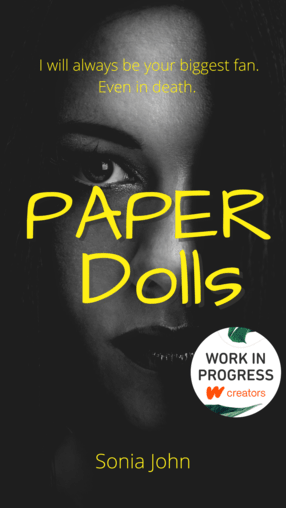

My only story covers that I did not design are the fanfiction ones.. Those were made by a very dear reader.
I'm still experimenting and improving, but if you are new to covers and don’t know where to start, maybe these tips can help you.
How to start designing covers
Start simple.
Choose a nice clear picture that you like. On Canva I use the ‘Your Story’ template size, it’s worked well for me so far. After you’ve chosen a picture, add in the title and your name (optional) and then you're done! You can also add stickers to enhance the image if your background is too simple. Canva has those options.
Remember, even if you don’t like the first cover you’ve made, you can always make a few more and choose from there. I usually make my friends choose for me 🙂
Choose a template related to your genre. It doesn't make sense to use a romance cover for a sci-fi story. We don’t want to confuse readers. The cover should hint at the genre, thus attracting a reader’s attention from the get go. For example, the cover below is for a sci-fi adventure story set in space. From the cover design, you can quickly gain this context.
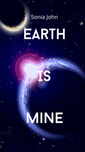
It can also help to research popular Wattpad books or traditionally published book covers in the genre you’re writing to help with inspiration or direction for your cover design
Choose eye catching backgrounds.
Seeing someone looking back at you has a way of drawing your attention. There are many covers like these on Wattpad with millions of reads. For example, check out the story cover for Plutonian below:
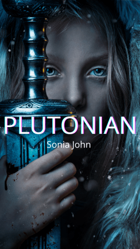
Make the title clear and easy to read.
Choose a simple, easy to read font and position for your title. There are popular trending fonts on Canva, such as Angelina, that you can use.
Don't overdo it.
Mixing too many images into one can sometimes distract a reader, making them lose interest.
Hint at the trope, but don't give away too much.
An air of mystery is always nice. A reader can always read the blurb to learn more.
Subheadings.
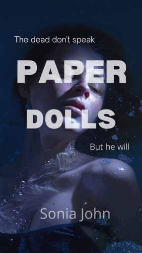
Subheadings work really well for mystery thrillers and horror novels. I’ve also seen subheadings used on a lot of traditionally published book covers. The subheading can add to the mystery by asking questions or hinting further at what the book is about. For example, check out the story cover for Paper Dolls:
I’ve found the journey of making covers and experimenting with different ones to be a fun one so far. Every new cover is a chance to learn something new. Sometimes making the cover can be equally exciting as creating the story. I hope the tips above are able to help you in your cover design journey. If you are just getting started on designing a cover for the first time or are refreshing your library of story covers, good luck and most importantly have fun!


