Styling your story


They say not to judge a book by its cover, but first impressions matter when prospective readers are browsing stories. Stories with covers get 23x more reads than those without. Your best shot at getting a reader's attention? A striking, click-worthy cover that is a clear reflection of the story you've written. A great cover will tease what's inside or speak to one of the major themes. Here are some tips on how to maximize your story's appearance.
Design for a thumbnail
Over 85% of readers on Wattpad are using mobile devices. Although the optimal cover dimension is 512 x 800 pixels, your cover may appear as small as a finger depending on what phone your reader is using. Keep in mind that the contrast between your typeface and imagery is more important the smaller your cover scales. Make sure your title is clear and obvious, so readers understand it immediately. Let's face it—it doesn't matter how great your title is if no one can read it.
Aim for bold imagery
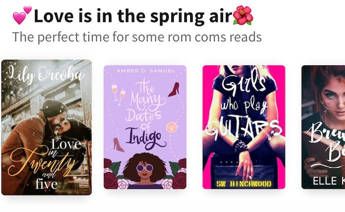
Iconic designer Dieter Rams put it best when he said: “Good design is as little design as possible.” While he wasn't a book designer per se, his advice holds up. Try to stick with simple, bold imagery that speaks to the content of your story. If we're staying with the less-is-more design philosophy, it's a good idea to ask yourself if everything you've included is absolutely essential. If not, scrap it. You use your words to create a tone within your story; your imagery should too. Angsty drama? Try something moody and dark. Cute and feel-good? Try something bright and sweet.
Keep it current and contemporary
Fresh covers attract new readers, so it's a good idea to update your cover every so often to give it a renewed shelf life. Even the shiniest covers can fade over time, and design sensibilities can shift and evolve over the years. A new, different-looking story cover can help entice new readers. It's a great way to reinvigorate the community and lure in readers who might've first passed the story to check it out again. Think of it as a refresh!
Choose a typeface carefully
Your typeface (or font) should pair perfectly with the imagery, but it can be tough to pick a typeface when you're not a professional designer. As a starting point, use a more traditional font for conventional, straight-forward images, or a more evocative and playful font if the story and imagery calls for it. Covers can also lead with fonts, rather than imagery. Font is potentially the most important element of a good cover and can be the main focus, with minimal designs or imagery in the background. When in doubt, keep it legible and keep it simple. Steer clear of novelty or grungy fonts, and choose from the professional fonts that you likely already have on your computer. You can also download free, professional typefaces from Google Fonts.
Run visual experiments
Wattpad is a great way to test the waters on what appeals most to people. With the help of our community, you can learn, iterate, and improve upon your story's appearance until you've reached perfection—or close to it! Try variations of your cover to see what style or mood attracts more readers, or turn your friends or fans into an ad-hoc focus group by asking them to pick which one they like best.
Learn by example
Take inspiration from cover designs you love. Look at your bookshelf or take a scroll through Wattpad. What drew you to certain covers? How can you incorporate similar elements into your own cover design to really make your story stand out?
Find resources
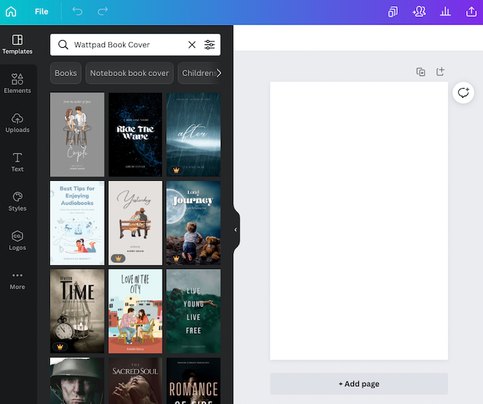
The Wattpad community has tons of free resources and services. Graphic storytellers and groups, photoshop phenoms, and creative peers are everywhere. If you want to take a crack at it yourself, Canva is an excellent free image editor. And it even has a Wattpad cover section, with exact sizes and proportions.
