Covers 101: Winning at DIY cover design


First impressions matter. As the gateway to your story, a great cover can be a game-changer. At the same time, it can be paralyzing to try to sum up all of your words and ideas into a single image. For that reason, many writers are intimidated by the cover process. Our aim with this module is to give you a few practical steps to build your cover confidence!
The DNA of a cover
Design small
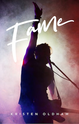
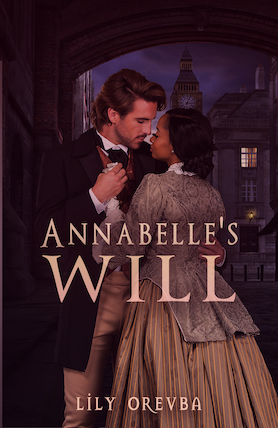
Over 85% of Wattpad users read on mobile. While covers are uploaded at 512 x 800px, your cover may be viewed in thumbnail size (meaning, literally, the size of a thumbnail!). So, when designing for Wattpad, follow these tips to create a captivating small cover!
- Create contrast between the title and image, as colors that are too similar become blurred and hard to discern in small sizes
- Choose a typeface for the title and your author name that can be legible even at 7- or 8-point size
- Less is more! Swap ornate illustrations in favor of minimalistic imagery that can be understood at a small size
Be bold
Iconic industrial designer Dieter Rams put it best when he said: “Good design is as little design as possible.”
While Rams wasn’t a book designer per se, his advice holds up. Try to stick with simple, bold imagery that speaks to the content of your story. It’s a good idea to ask yourself if everything you’ve included in your design is absolutely essential. If not, scrap it.
You use your words to set the tone of your story, why not use your imagery to do the same? Angsty drama? Try something moody and dark. Cute and feel-good? Try something bright and sweet!
Make your title legible
This isn't an eye exam, so choose your typeface (or font) carefully. The title should pair perfectly with the imagery. It can be tough to pick a typeface when you’re not a professional designer, but as a starting point, pair a more traditional font with straight-forward imagery, or a more evocative, playful font if the story and imagery calls for it.
Don't know where to begin? Google and Canva both offer a starting set of striking typefaces for most genres. If you feel you need something extra, fonts can be purchased and imported into design software (or Canva Pro) from places like YouWorkForThem and Creative Market.
Reminder: type design is important and font use is governed by licenses. It's illegal to use stolen fonts from freebie sites unless explicitly stated by the creator that the font is free to use.
Get feedback or run experiments
Wattpad is a great way to test the waters on what appeals to people. With the help of our community, you can learn, iterate, and improve upon your story’s appearance until you've reached perfection or close to it.
Try variations of your cover to see what style or mood attracts more eyeballs, or turn your friends and fans into an ad hoc focus group by asking them which would capture their attention on a bookshelf.
Get inspired
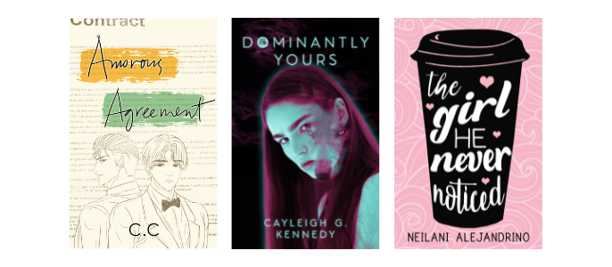
Take inspiration from other covers in your genre and beyond. Head to your local bookstore, flip through your Wattpad library, and look at your own bookshelf. What draws you in? What are some common elements in your genre?
Start to notice patterns. You might find yourself noticing that fantasy YA covers use a lot of emblems as their imagery, for example. What is the emblem that represents your story? Can you find something that would look striking on your cover? In the romance genre, you might find that sweet, illustrated covers pull you in. In which case, can you find a stock illustration that tells the story you’re trying to convey?
Use your resources
The Wattpad community has tons of free resources and services for writers looking to level up their cover game. Graphic storytellers and groups, photoshop phenoms, and creative peers are everywhere. If you want to take a crack at it yourself, Canva is an excellent free image editor. Bonus: it has a Wattpad cover section, with exact sizes and proportions!


